03/2026
CHOCOLATE PACKAGING
Context
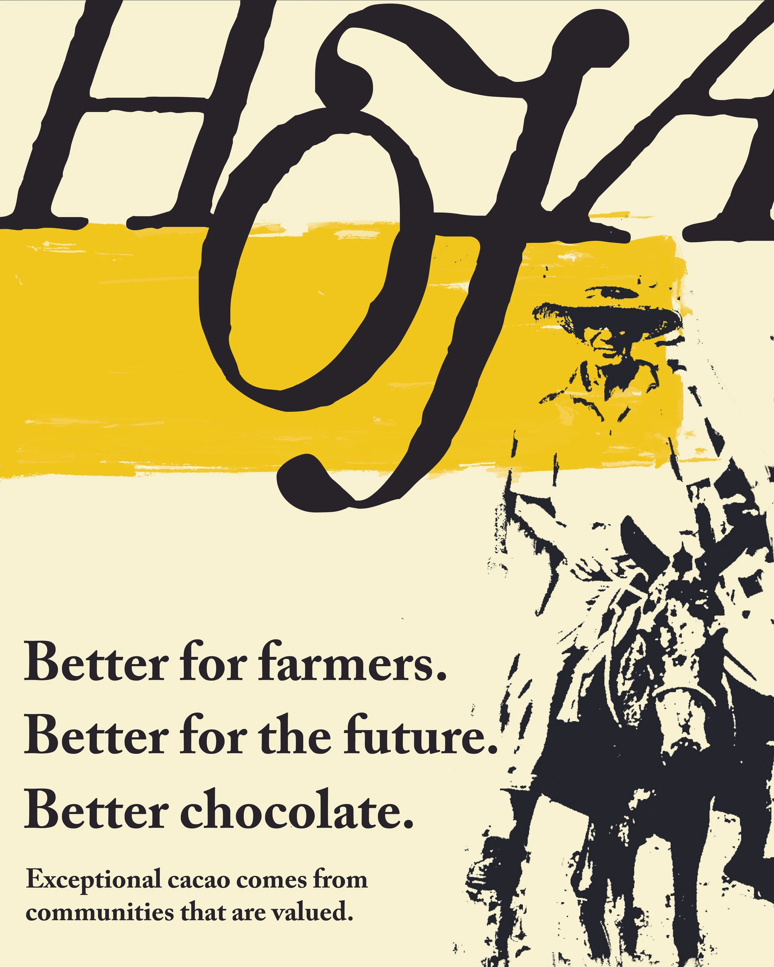
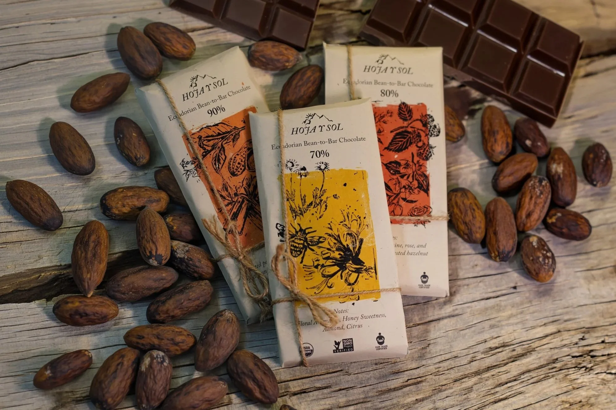
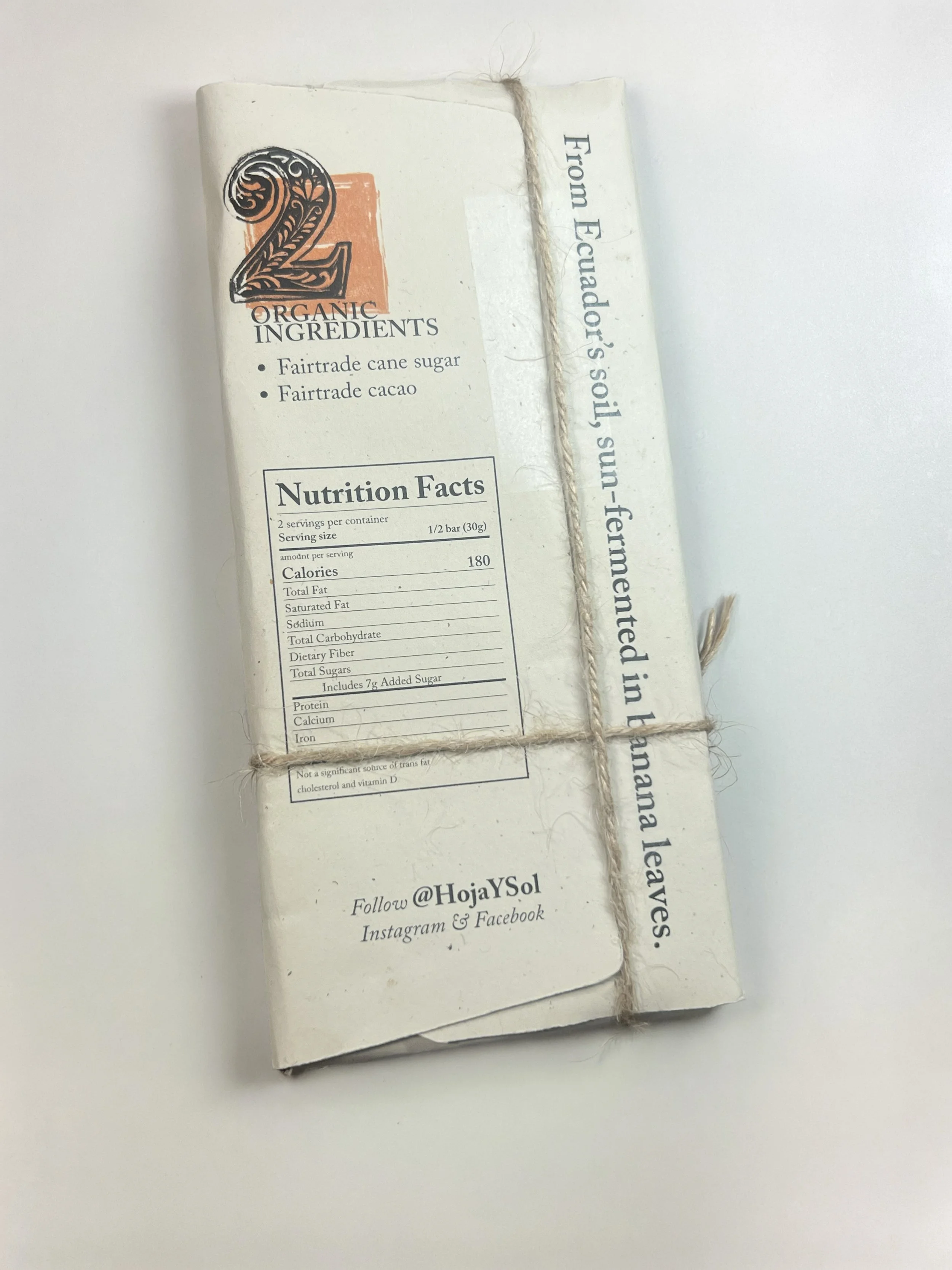
Hoja y Sol is an Ecuadorian chocolate brand designed to represent its cultural region while communicating its fair-trade and organic values. The chocolate is inspired by a traditional process in which cacao beans are wrapped in banana leaves and dried in the sun. Rather than positioning it as an everyday grocery-store product, I developed the brand as a premium gifting experience centered on Ecuadorian craft, origin and flavor.
The target consumer is an expressive and adventurous 25-to-40-year-old who values high-quality products, cultural storytelling and discovering new experiences.
Challenges
The primary challenge was balancing several ideas within one cohesive identity. The packaging needed to feel luxurious while maintaining an organic, handmade quality. It also had to communicate the chocolate’s Ecuadorian origin, sustainable values, production process and different cacao percentages without becoming visually overwhelming.

Process
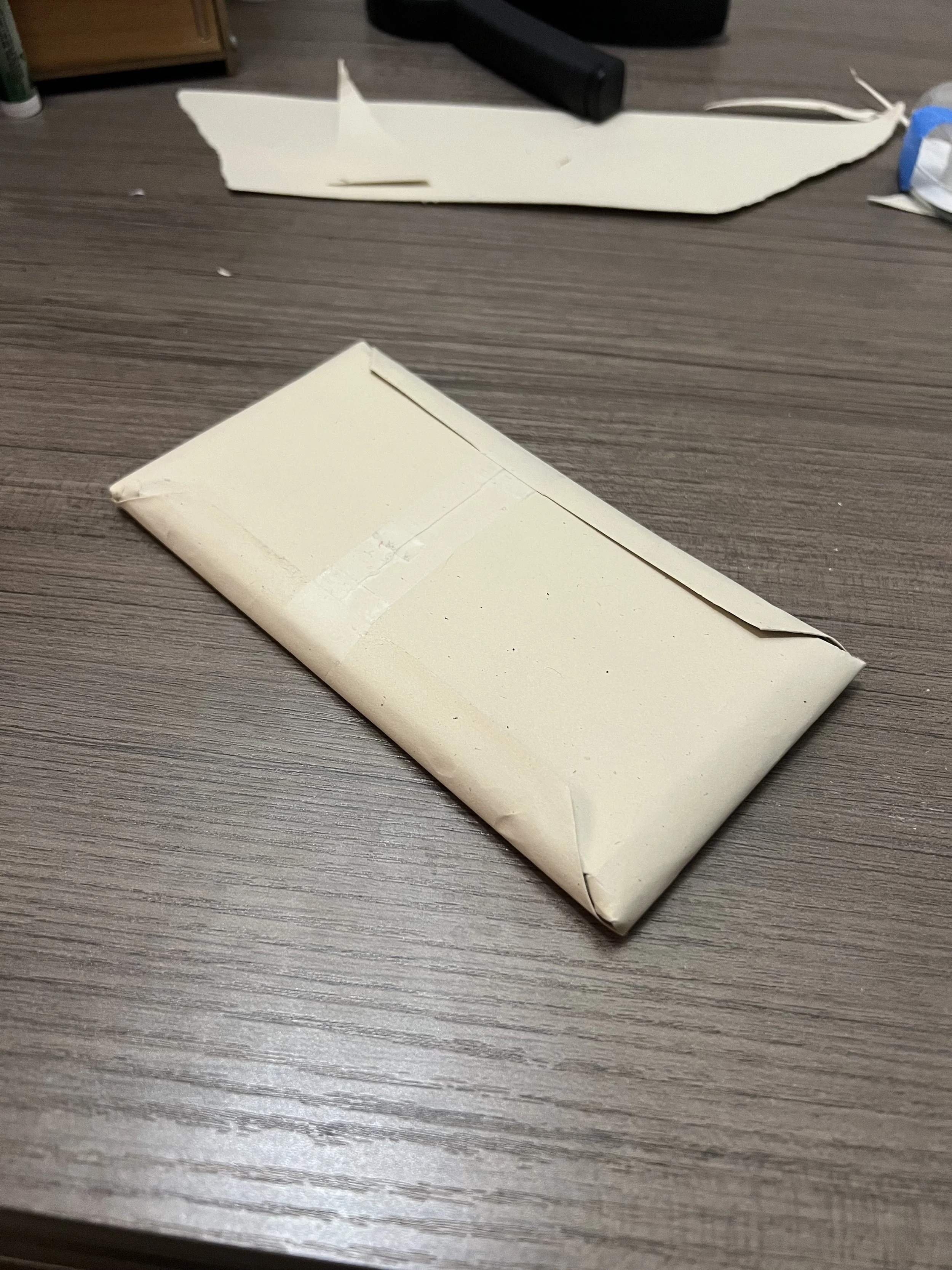
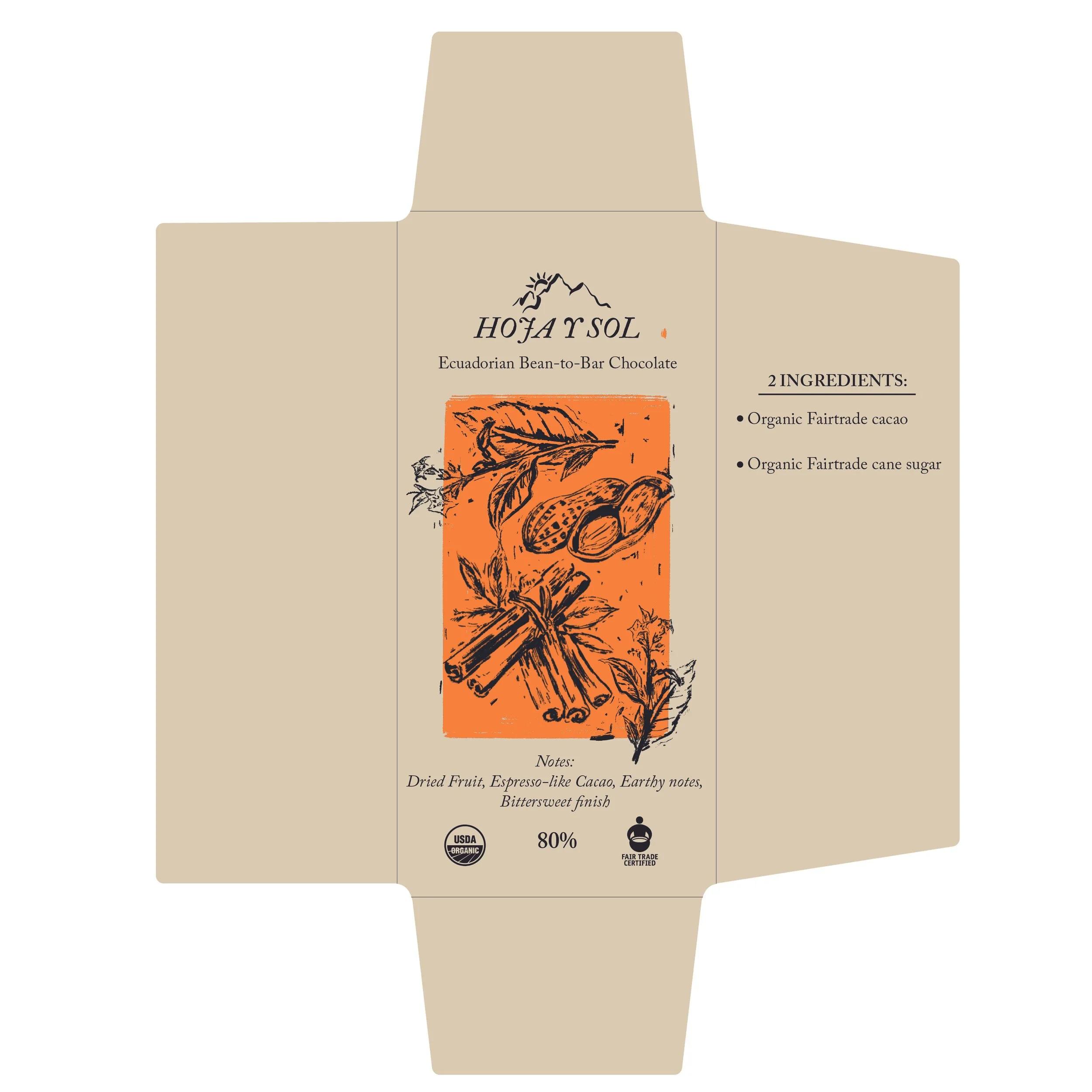
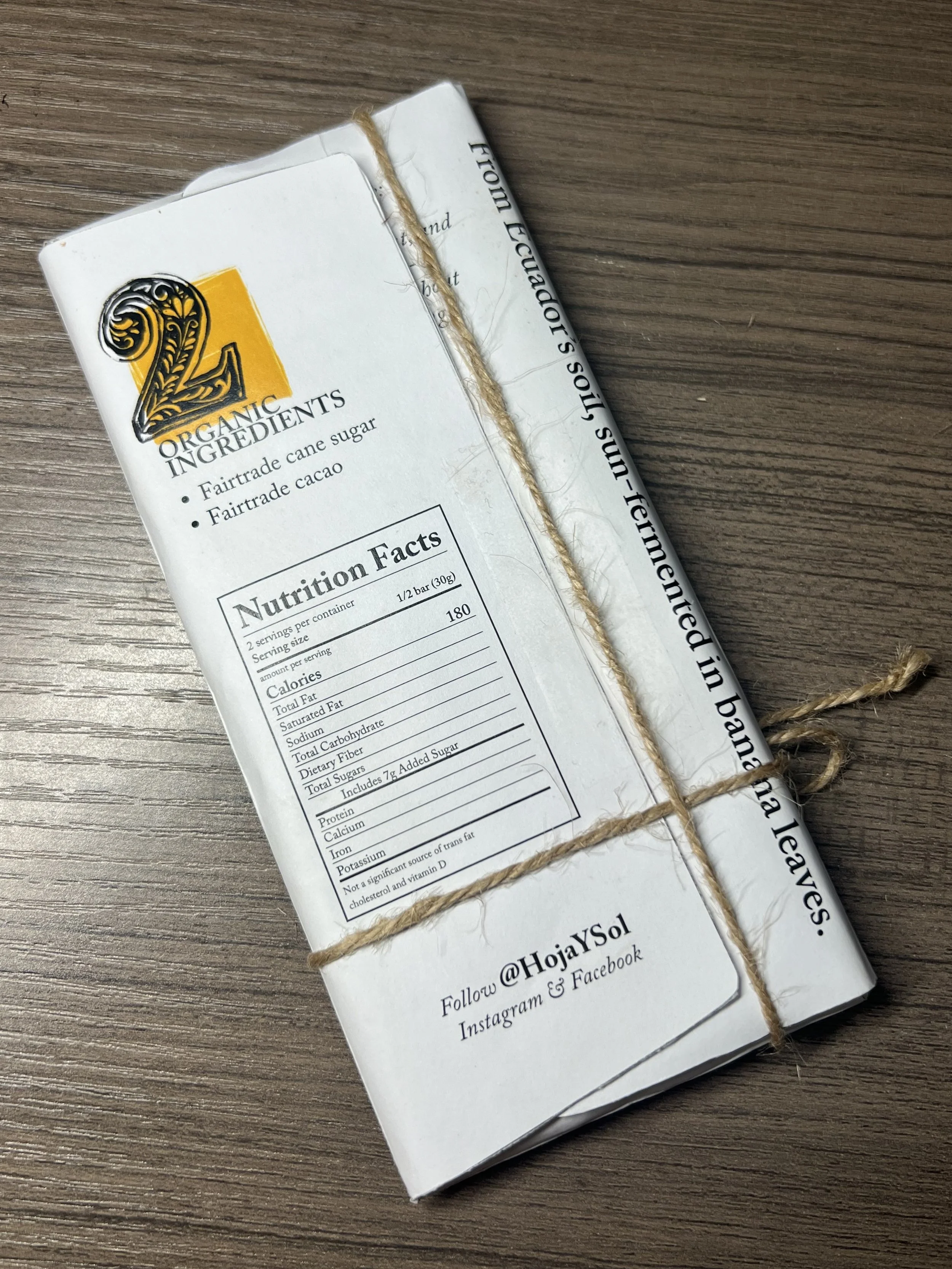
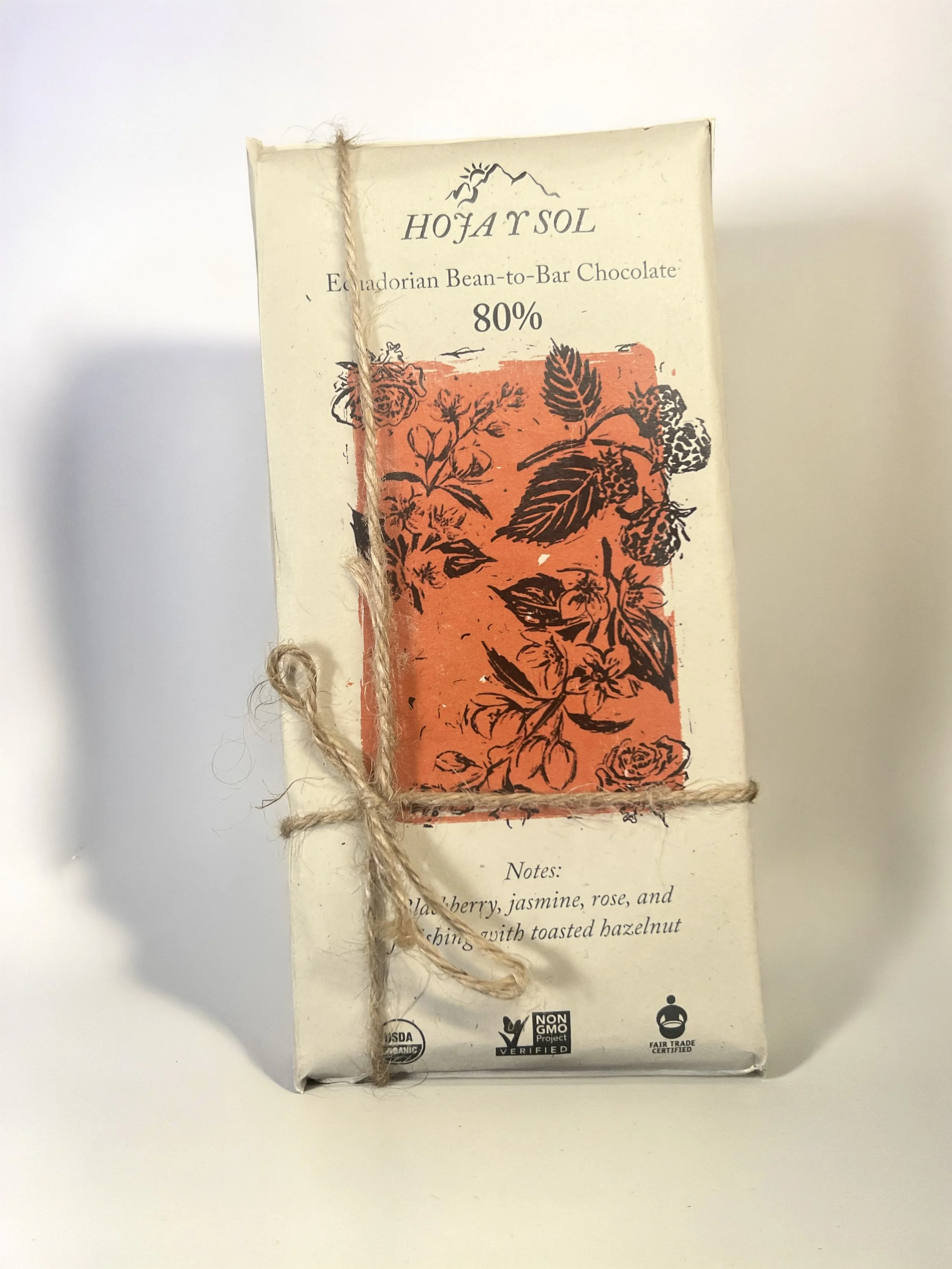
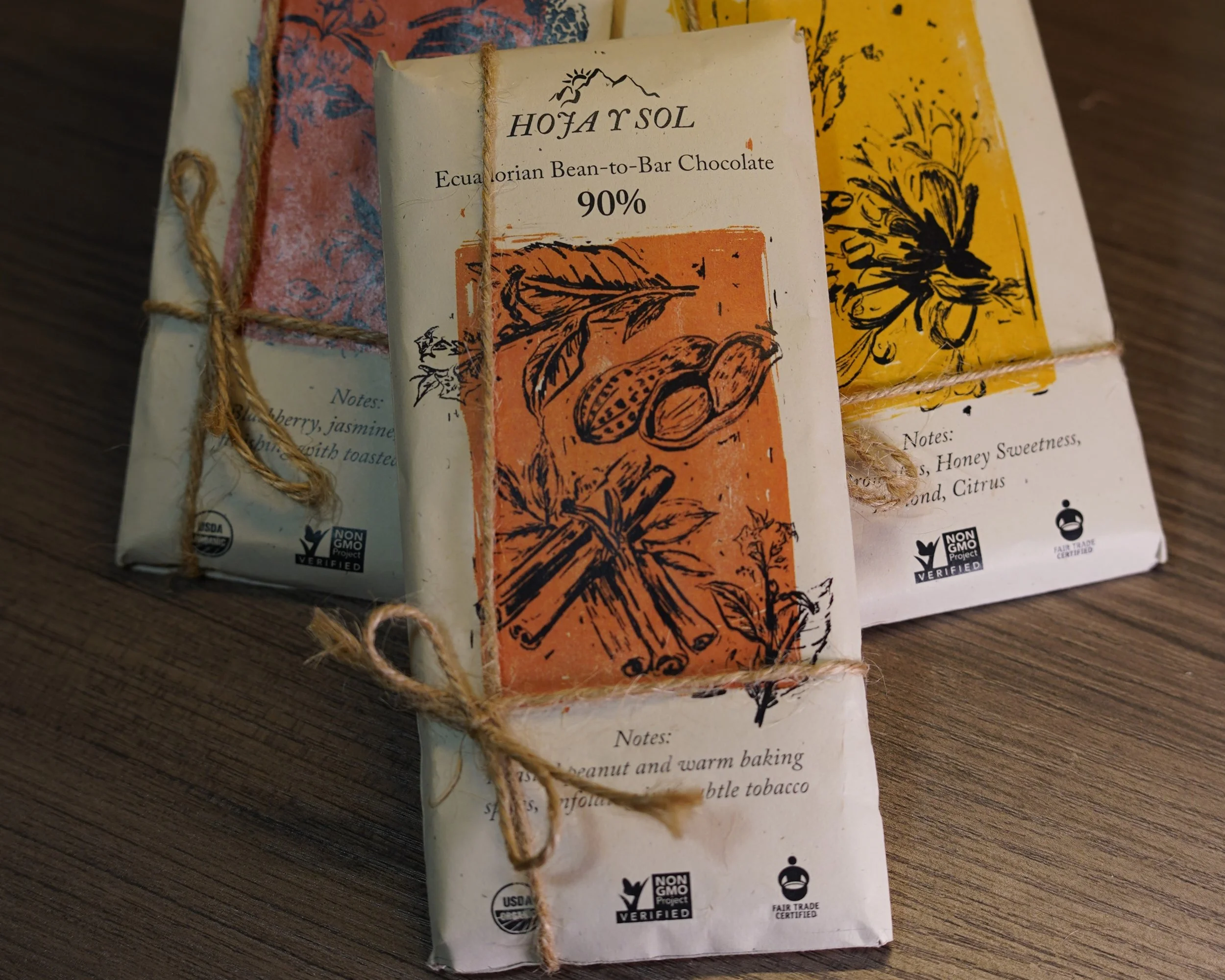
I began by identifying process over final product as the central theme of the brand. The packaging was designed to resemble a hand-wrapped gift, using paper color reminiscent of butcher paper to create an artisanal feel. A hand-tied hemp string bow adds to the unboxing experience, while tasting notes on the front help introduce the flavor and origin of each bar.
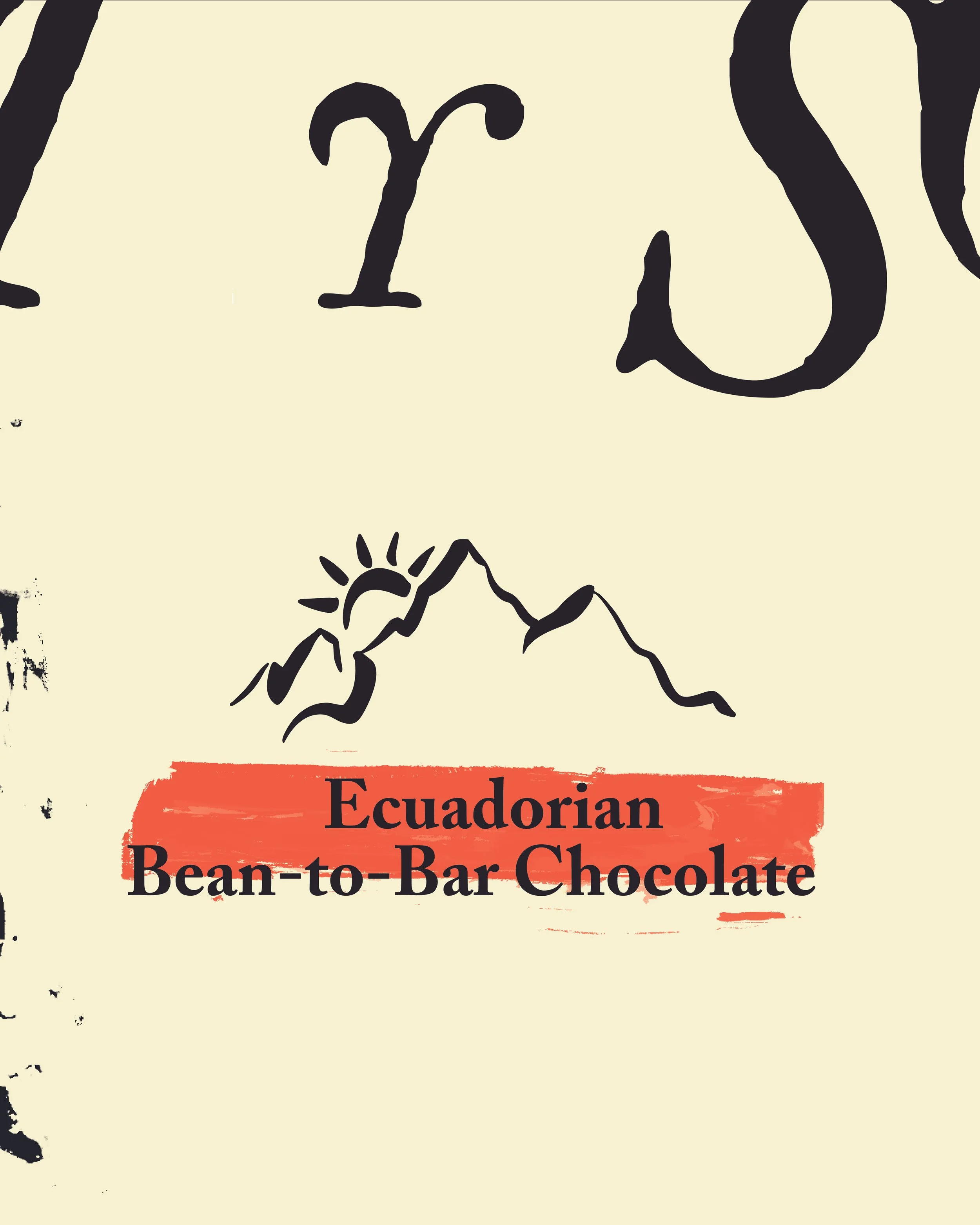
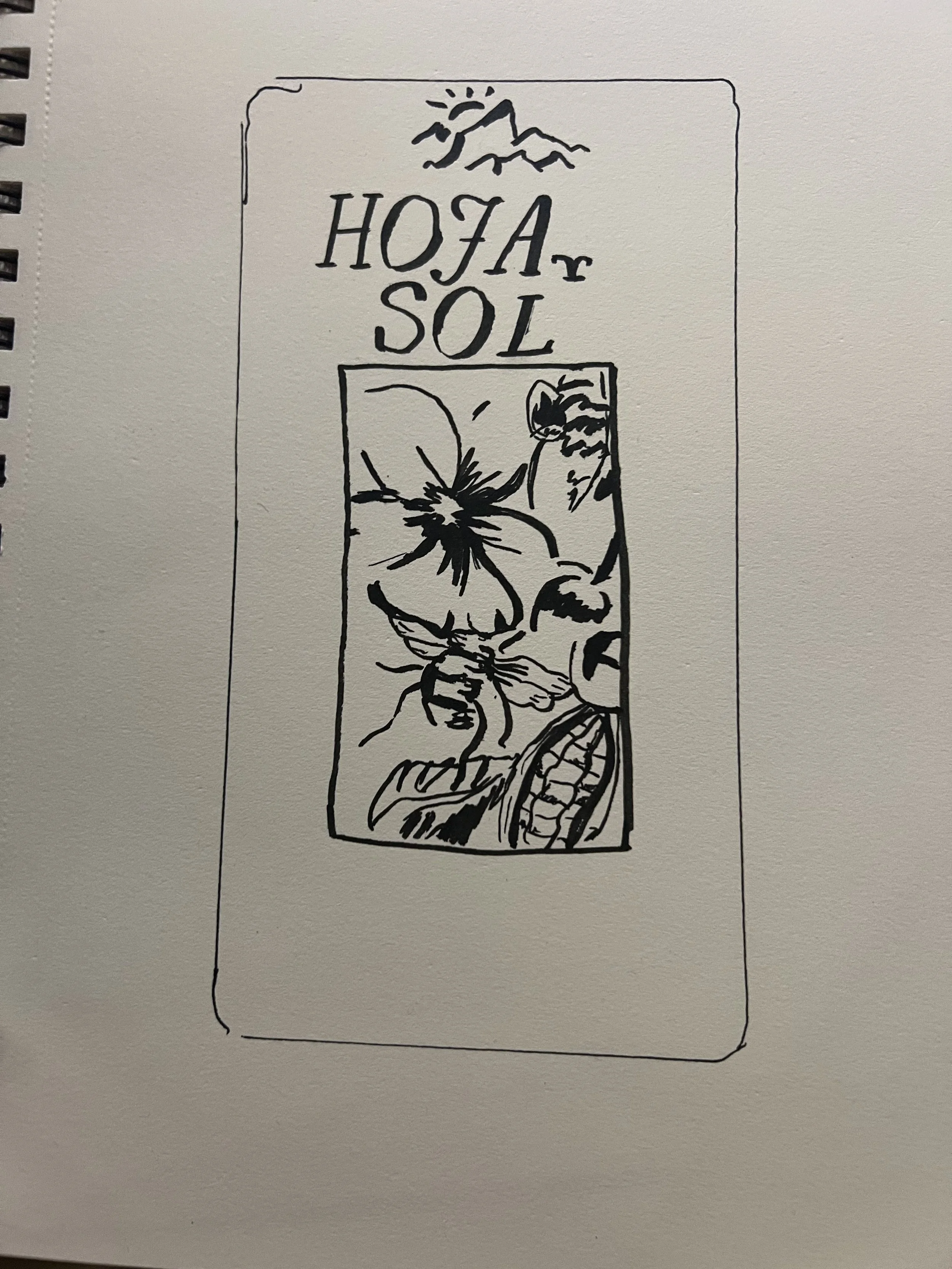
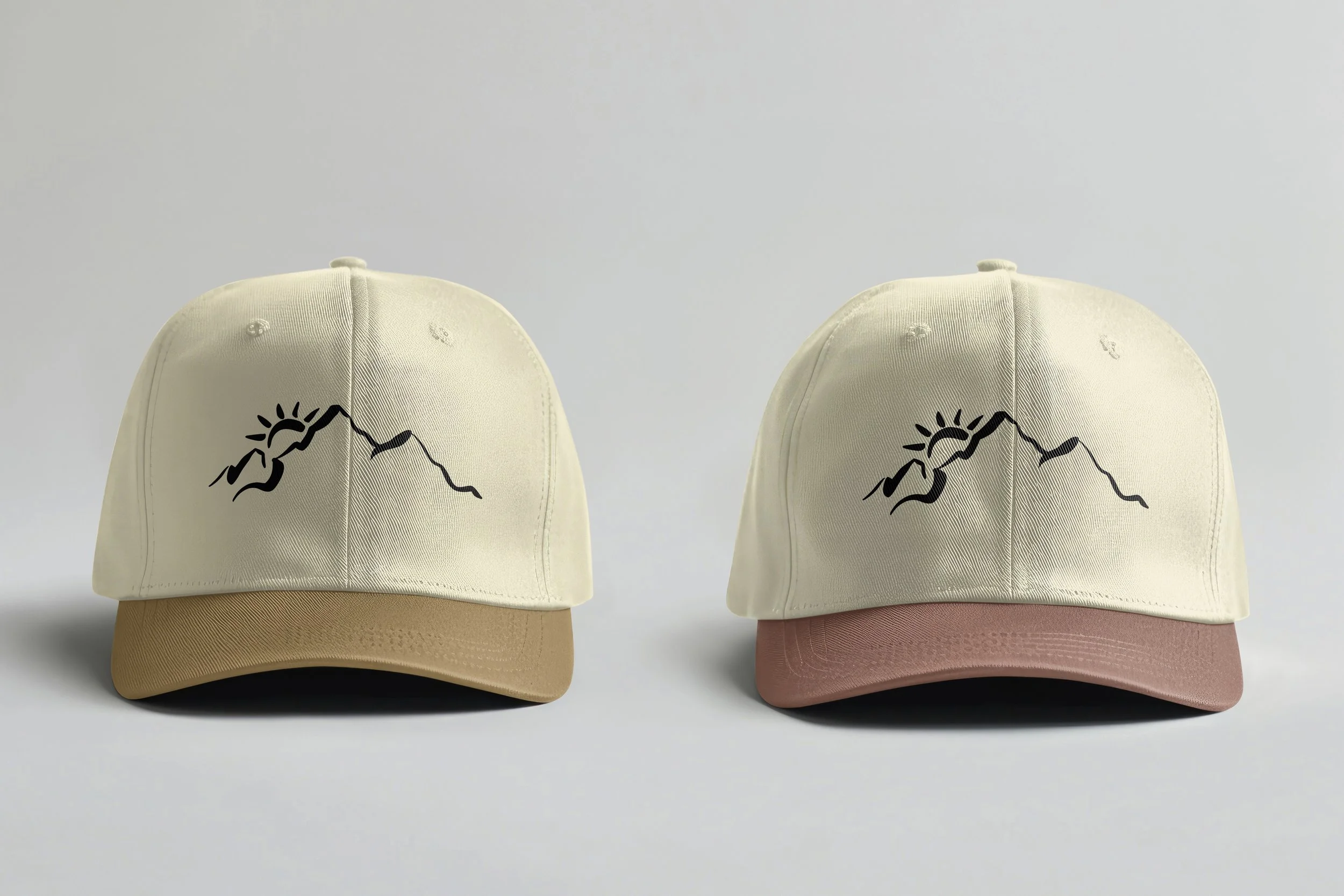
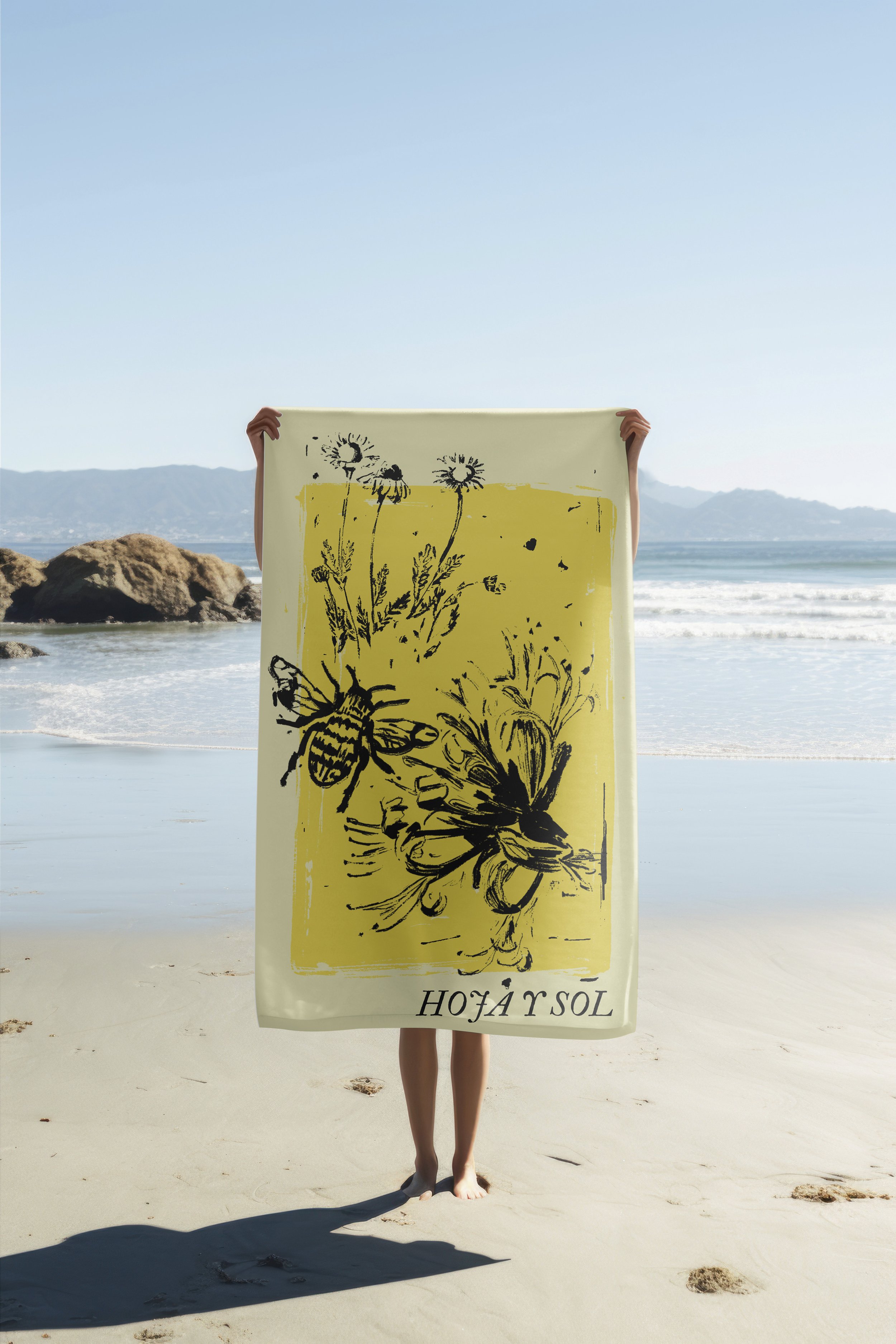
The Hoja y Sol logo incorporates the Andes Mountains, referencing the distinctive Ecuadorian environment that influences the cacao’s character and taste. Different cacao percentages are identified through block-print-style illustrations depicting the unique flavor notes of each variation.
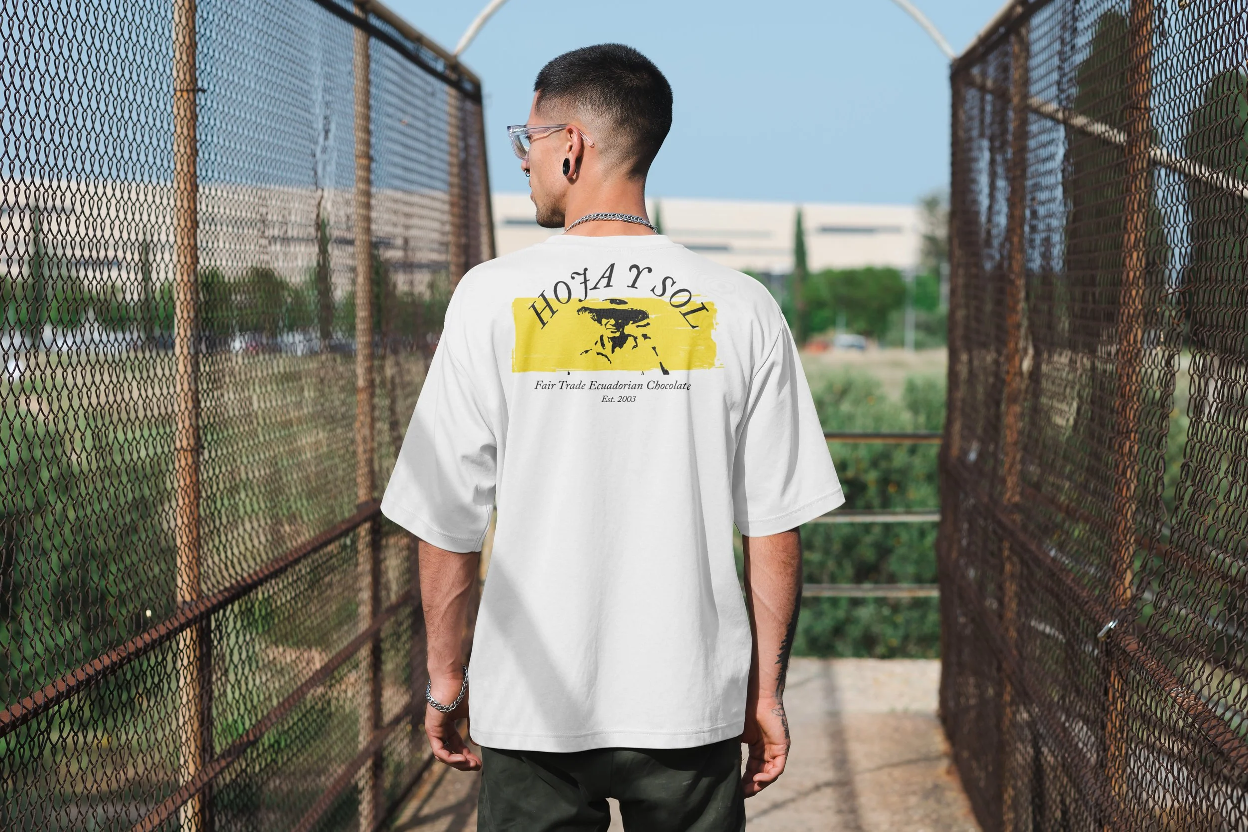
Typography with varied, characterful letterforms supports the handmade personality while remaining consistent throughout the system. I then expanded the identity across merchandise, marketing materials and social media to demonstrate how the visual language could operate as a complete and recognizable brand experience.