12/2024
COCHIN POSTER

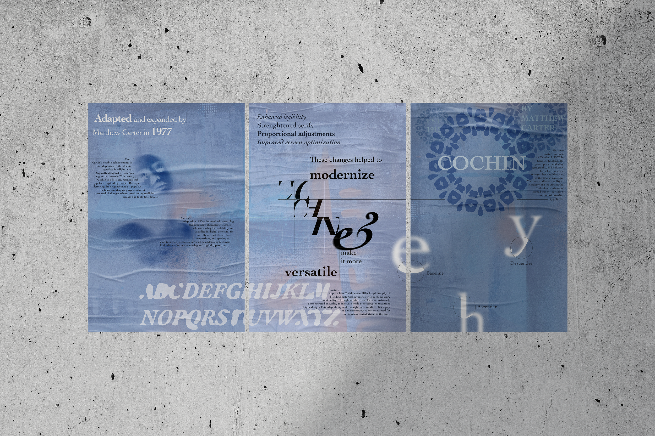
Context
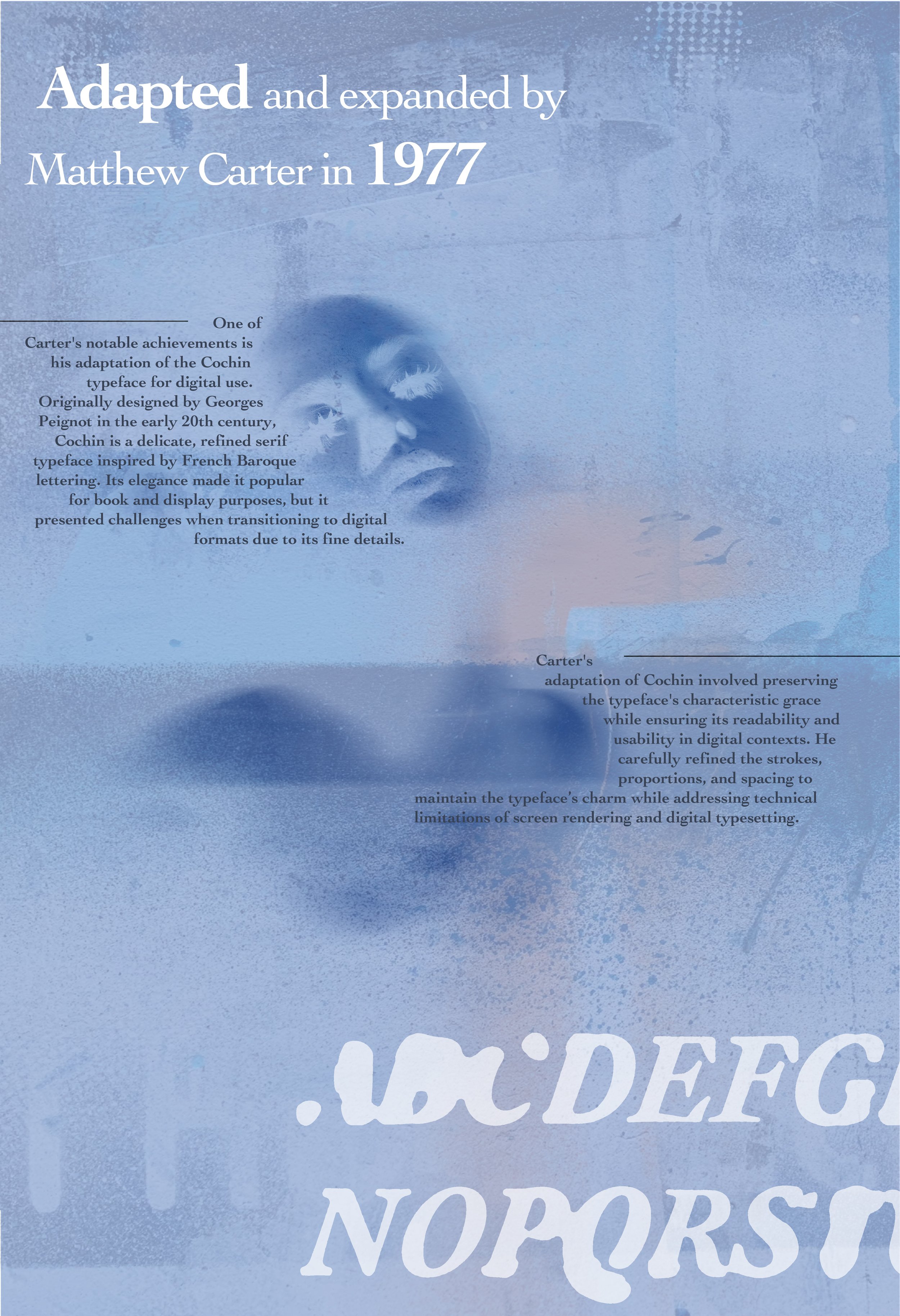
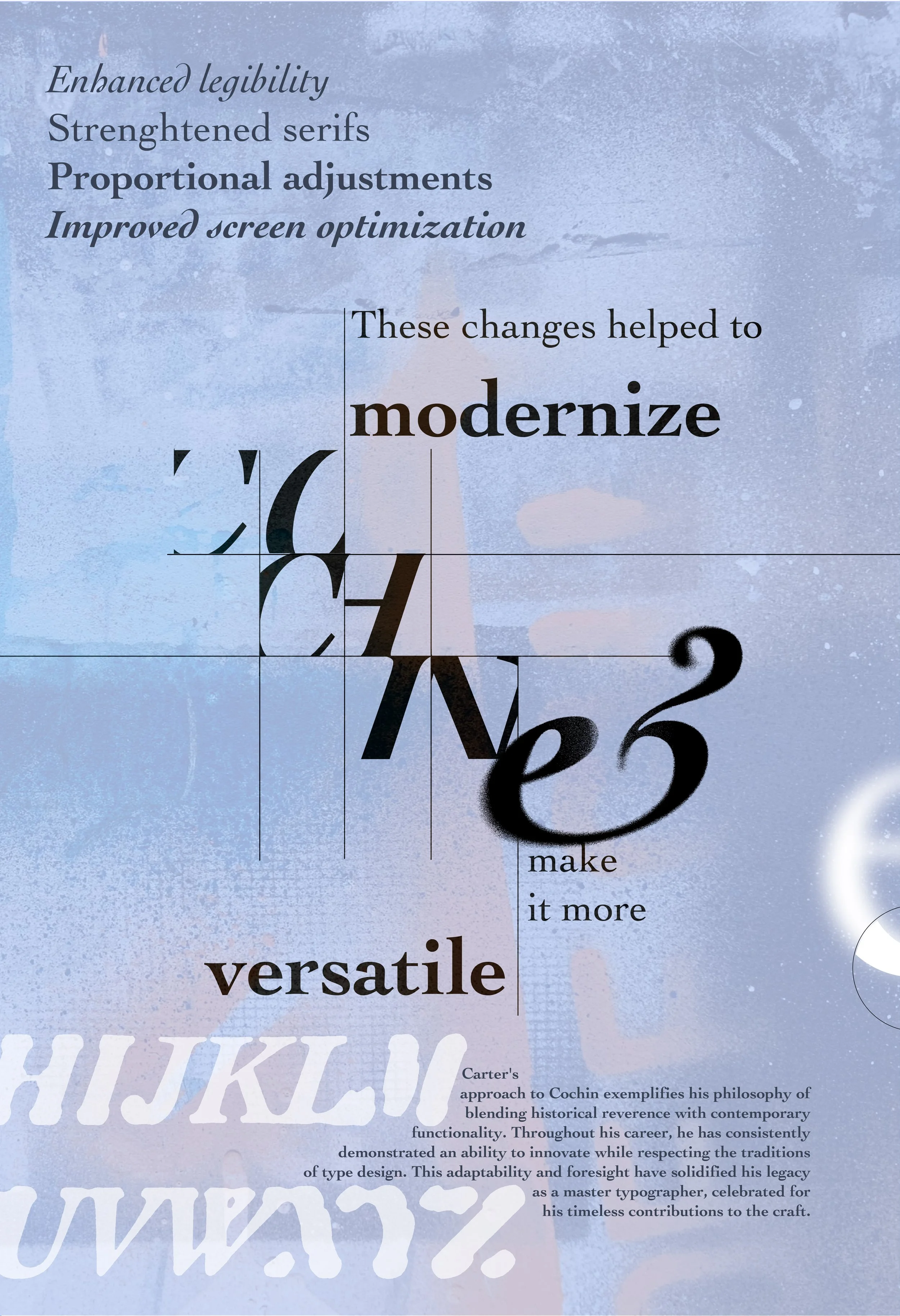
This project explored the history and modern relevance of the Cochin typeface. I researched Matthew Carter’s revision of Cochin for the digital age, focusing on how he preserved its elegance while adapting it for contemporary use. The triptych design highlights Cochin’s timeless qualities, bridging traditional typography with modern digital design.
Challenges
The main challenge was modernizing a historic typeface while honoring its heritage. Working in a triptych format was also new, requiring careful attention to flow and cohesion across three panels. Balancing education, hierarchy, and visual unity pushed me to think critically about type as both form and history.
Process
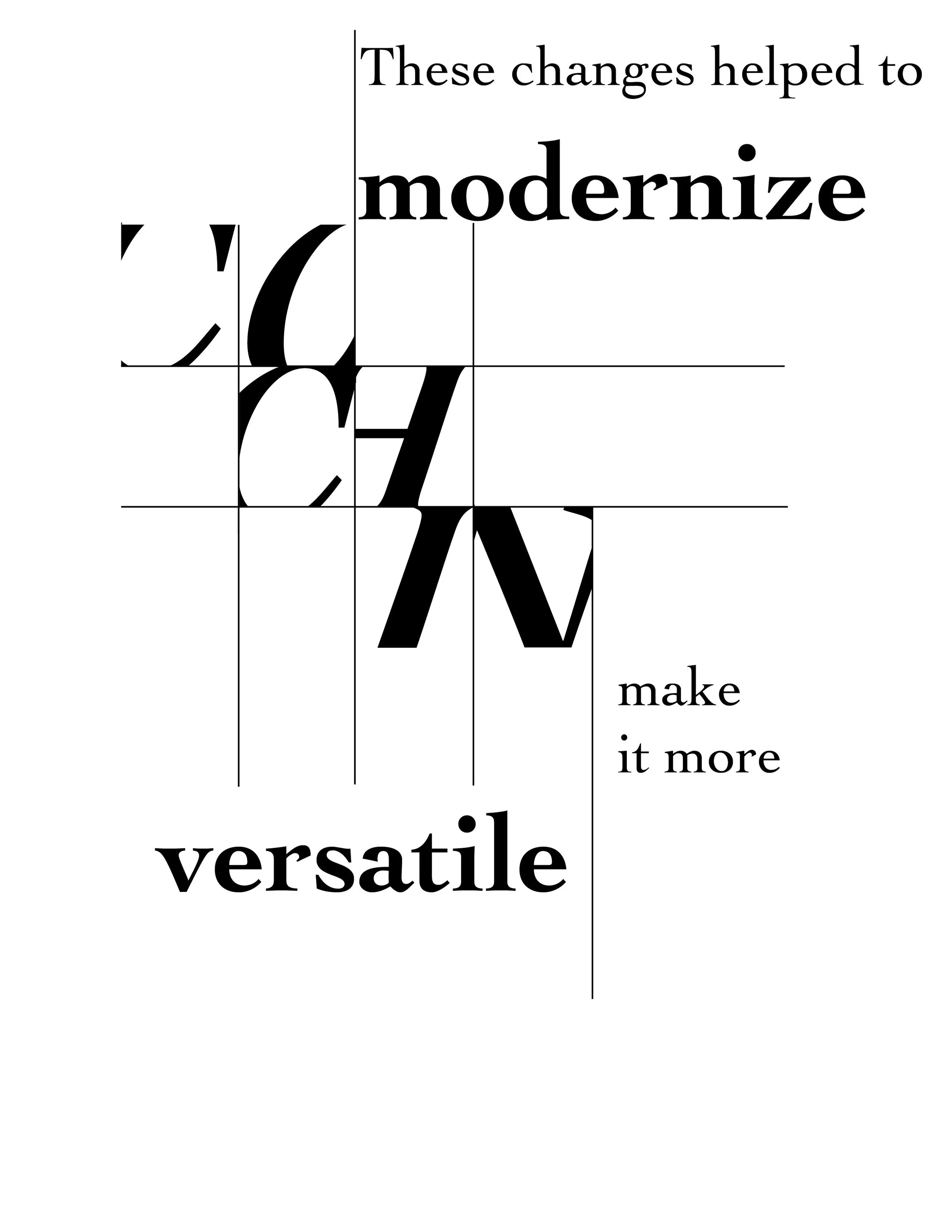
I began by studying Carter and experimenting with Cochin’s letterforms to showcase their character and versatility. From there, I developed layouts featuring a quote, a restrained color palette, and the full type family in varied sizes. To unify the design, I incorporated organic text flow and a subtle graffiti-inspired aesthetic, creating a piece that feels contemporary while educating viewers about the typeface’s legacy.