02/2025
SDSU MOVE-IN BRANDING

Context
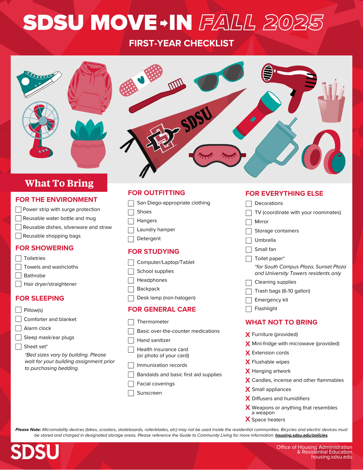
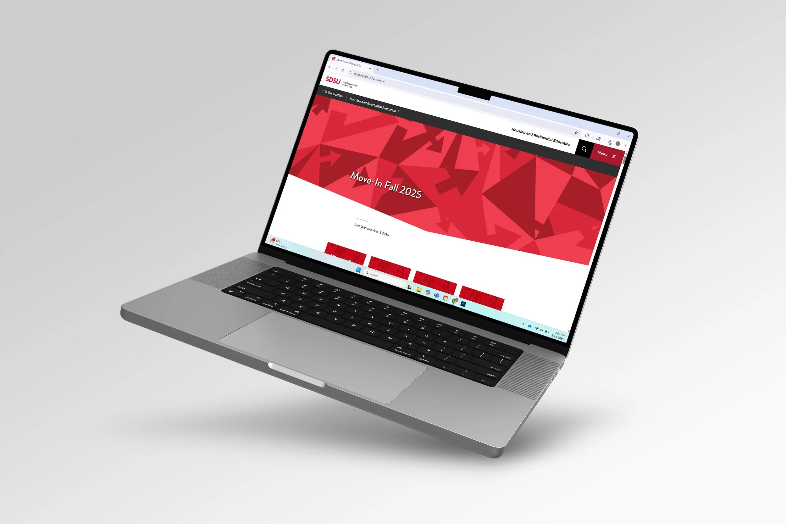
I was tasked with creating the new move-in branding for SDSU Housing, starting with a website banner that would set the tone for posters, social media assets, and print materials. The branding hadn’t been updated in years, so this project was meant to be a fresh, long-lasting system that could be reused in future semesters.
Challenges
The first banner was the most difficult piece—it needed to be timeless, align with SDSU’s housing brand goals of modern, vibrant, and minimal, and set the visual foundation for all other assets. Move-in is often stressful for students and parents, so the branding also had to communicate clarity, excitement, and ease of use.
Process
I began by listing adjectives I wanted the design to convey, then sketched concepts that matched the housing team’s goals. Arrows emerged as the strongest symbol, representing movement, direction, and a fresh start. I designed a sharp, dynamic arrow pattern in SDSU’s brand colors using Illustrator, which became the core graphic for the system. From there, I applied the style across website graphics, Instagram stories, and educational flyers, creating a unified package. Through revisions and refinements, I learned the value of simplicity—using minimal design to deliver a clear, professional, and lasting message.