Whiskey Packaging
05/2026

Context
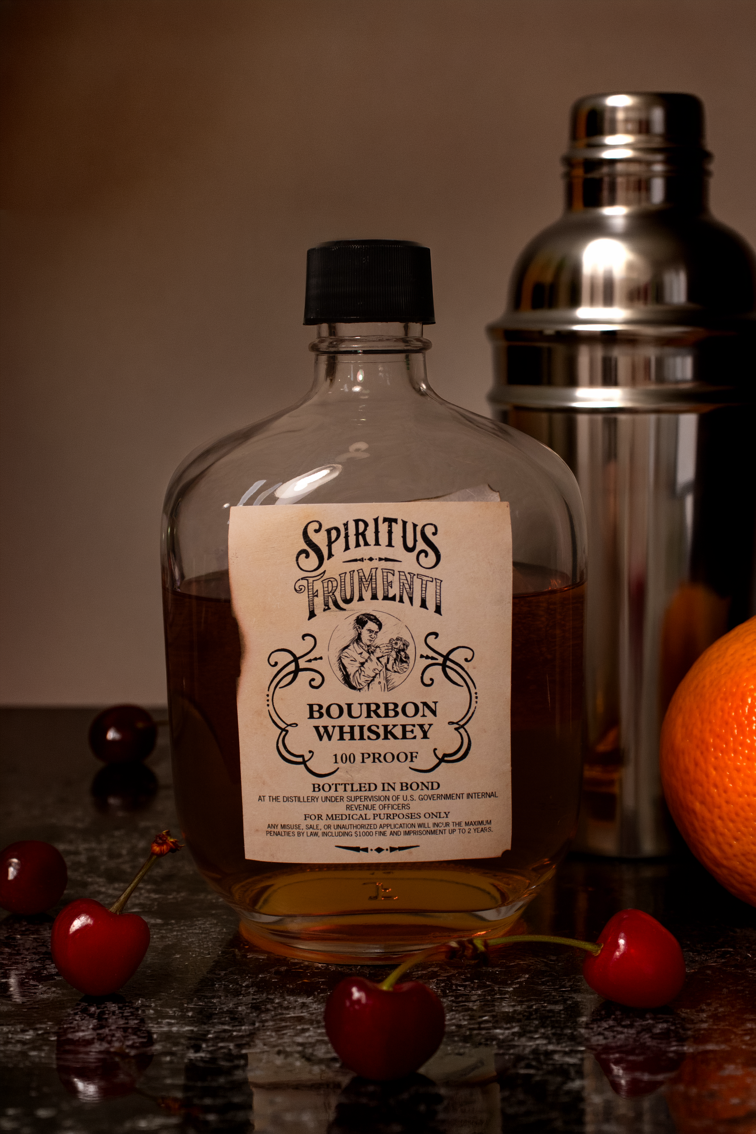
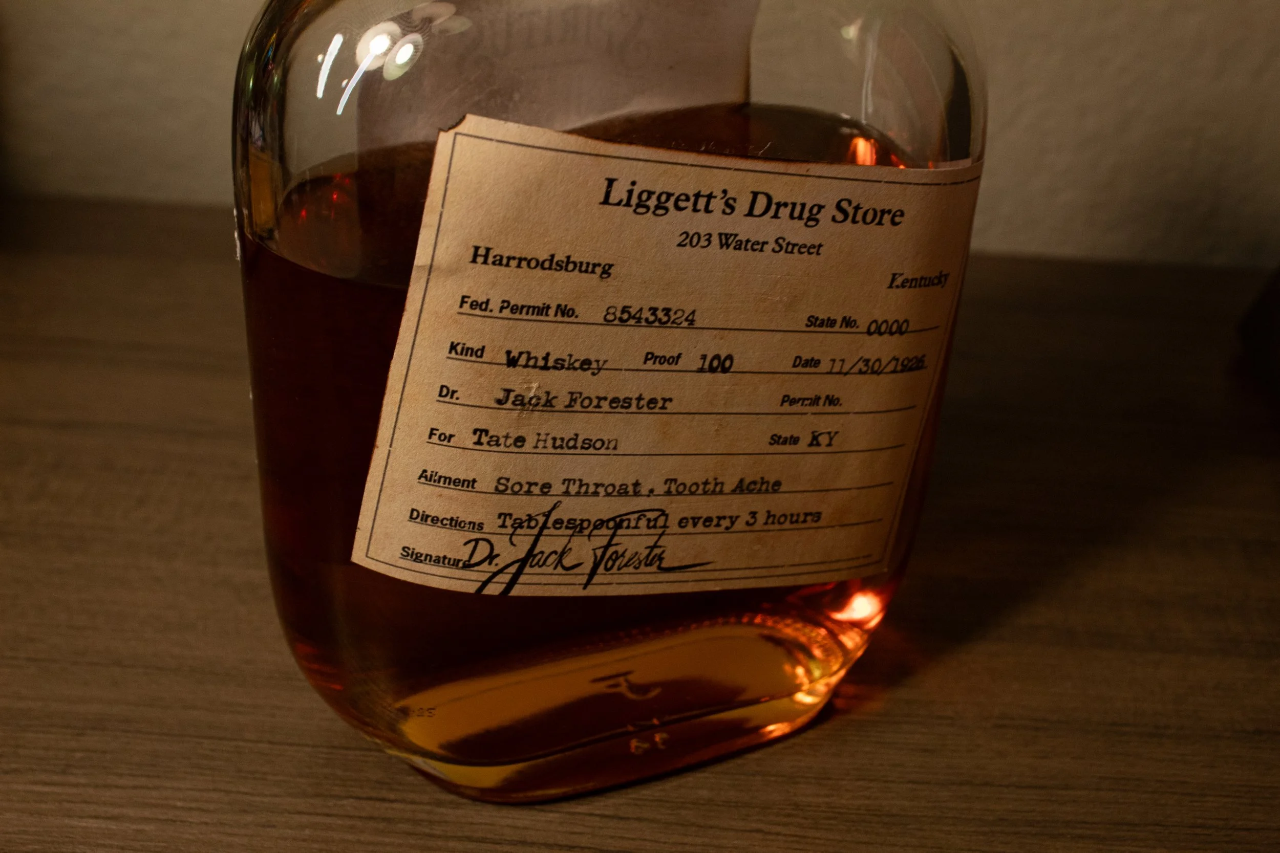
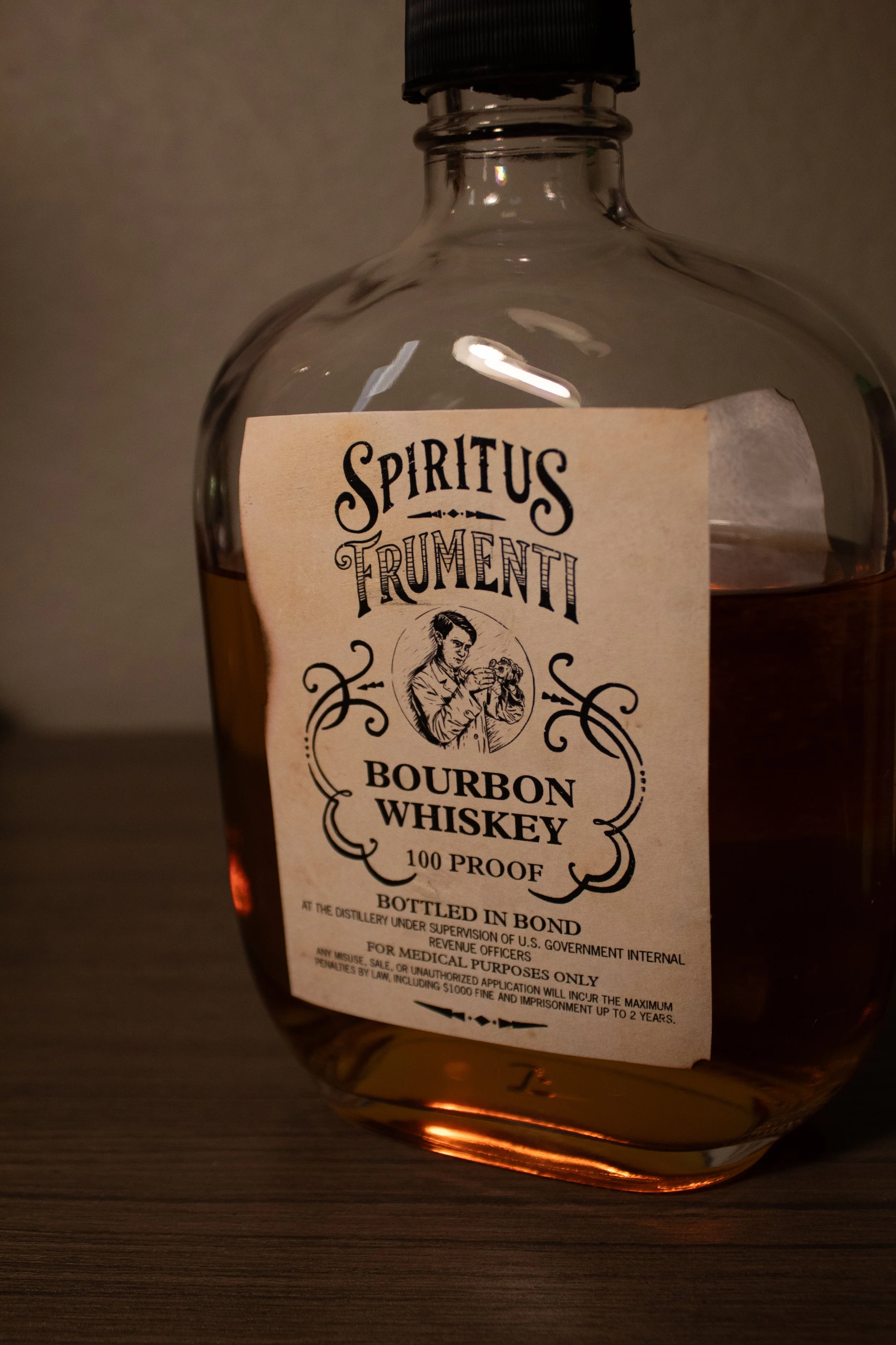
For this project, I explored how packaging design can tell a story through history and detail. I created a whiskey bottle concept inspired by the Prohibition era, combining antique medicinal aesthetics with modern branding to create an immersive and collectible product experience.
Challenges
One of the main challenges was capturing a historically accurate look while still making the product feel marketable today. I also worked to balance a professional, high-quality appearance with an engaging concept, ensuring the design felt authentic without becoming overly theatrical or gimmicky.
Process
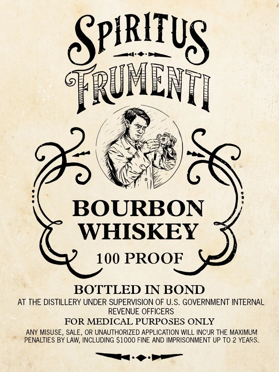
I began with research into Prohibition-era packaging and Art Deco influences, studying vintage labels and typography to understand their structure and tone. From there, I explored hand-drawn logo concepts and experimented with type and layout to fit the form of the bottle and label.
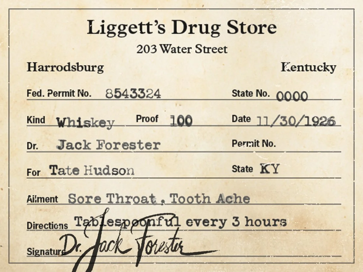
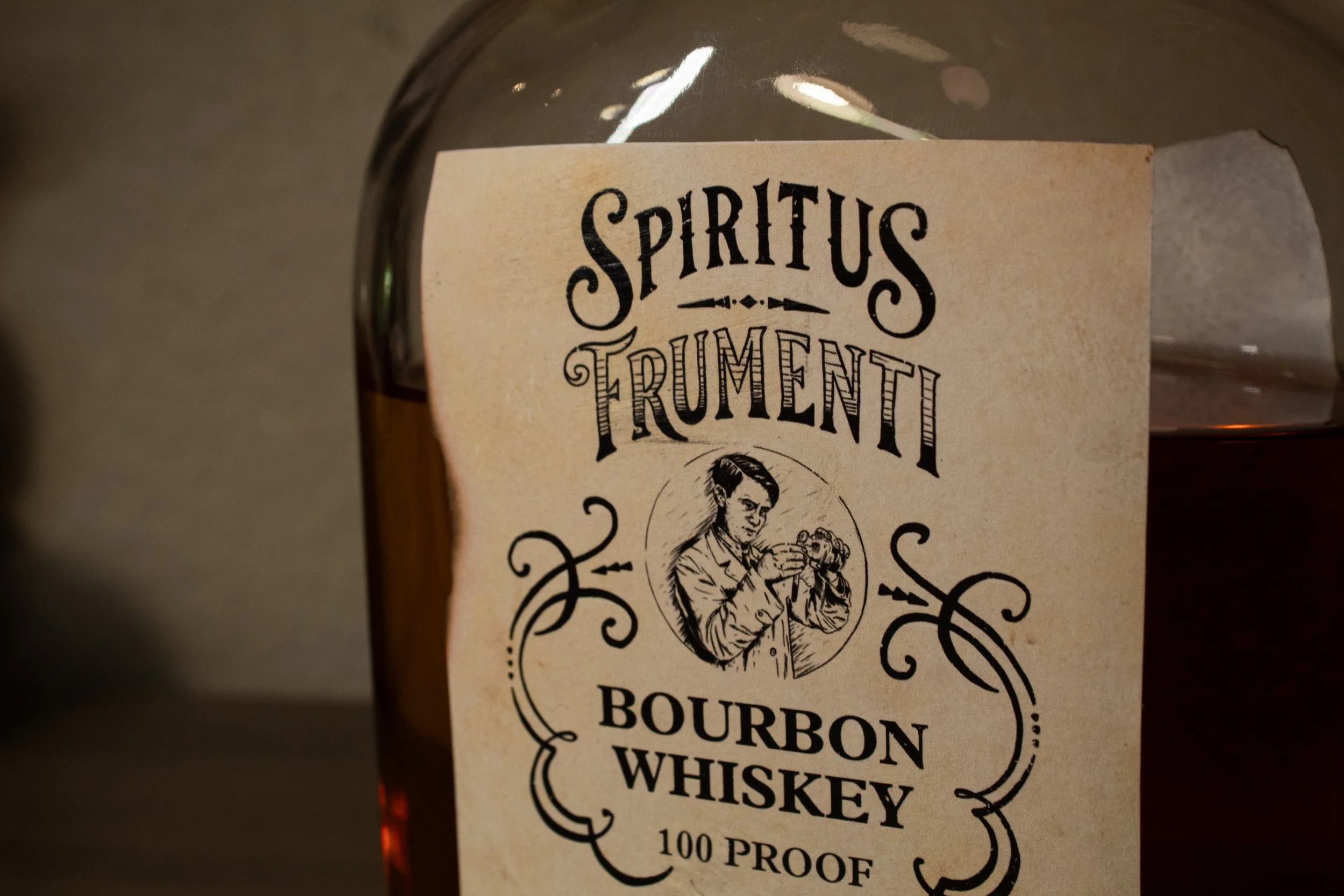
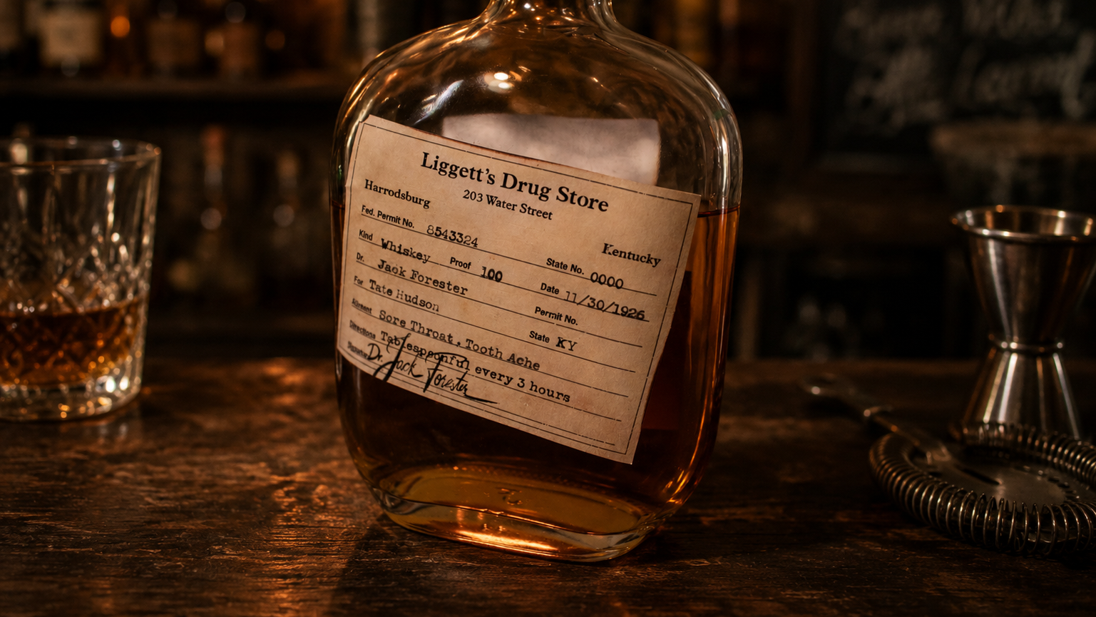
After refining the direction, I developed the final label using typefaces inspired by traditional whiskey branding and added distressing techniques to give the design a worn, aged feel. The inclusion of a prescription-style label reinforces the medicinal narrative and adds a layer of storytelling to the product.



07/2025
Packaging Rebranding

Context
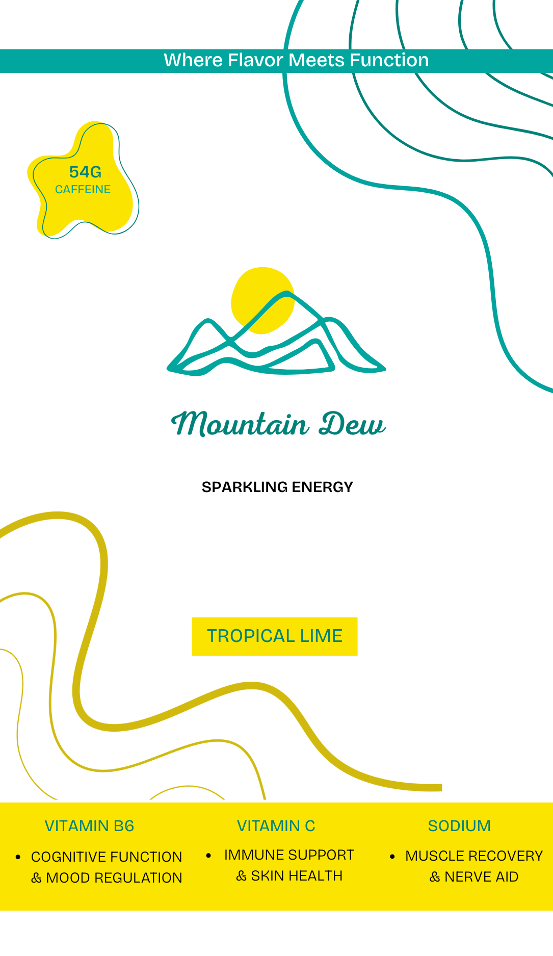
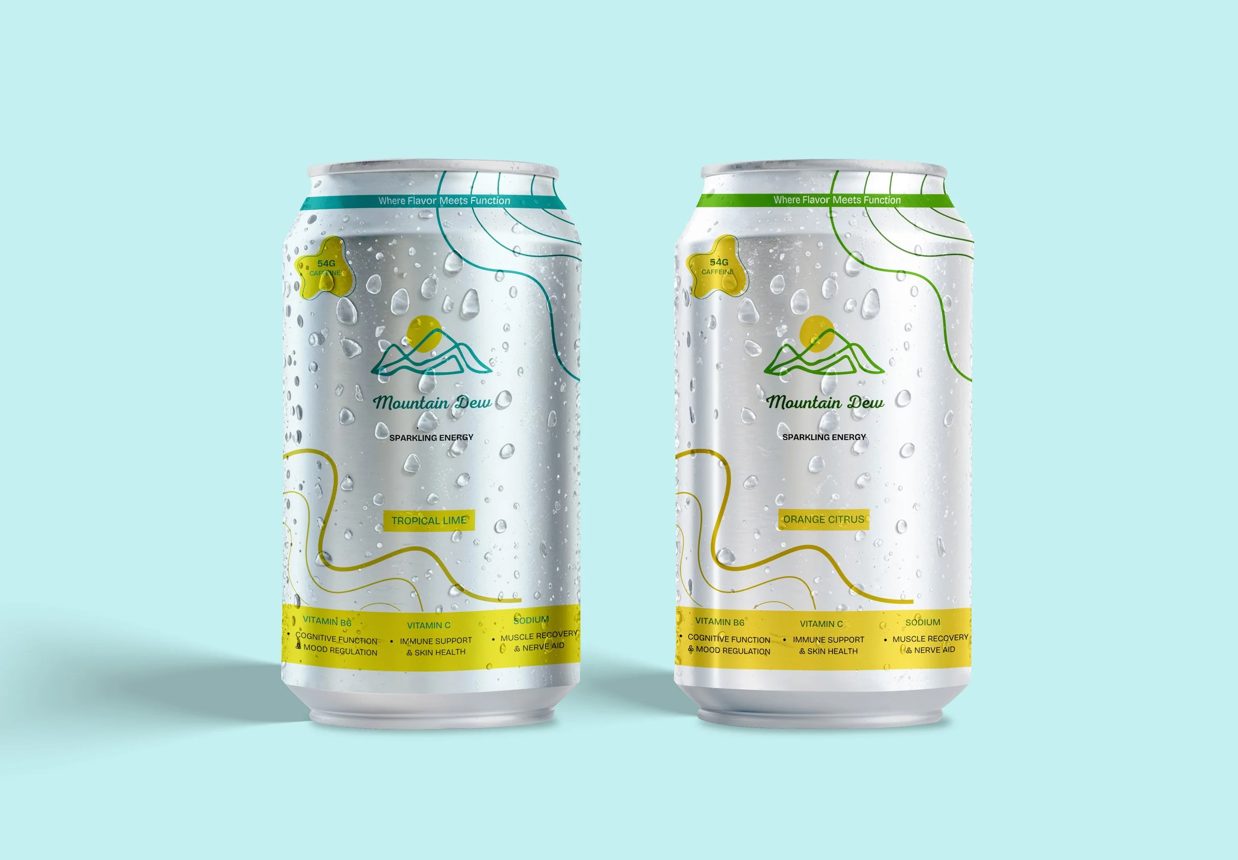
This project started with a question: What if Mountain Dew was sold at Whole Foods? I wanted to explore how design and marketing can completely reshape the way we perceive a product, even without changing what’s inside the can.
Challenges
The main challenge was believability. I needed the rebrand to look like it could genuinely sit on a Whole Foods shelf while still being recognizable as Mountain Dew. That meant carefully blending the brand’s neon, high-energy identity with the earthy, wellness-driven aesthetic of health food packaging.
Process
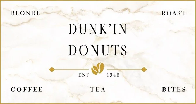
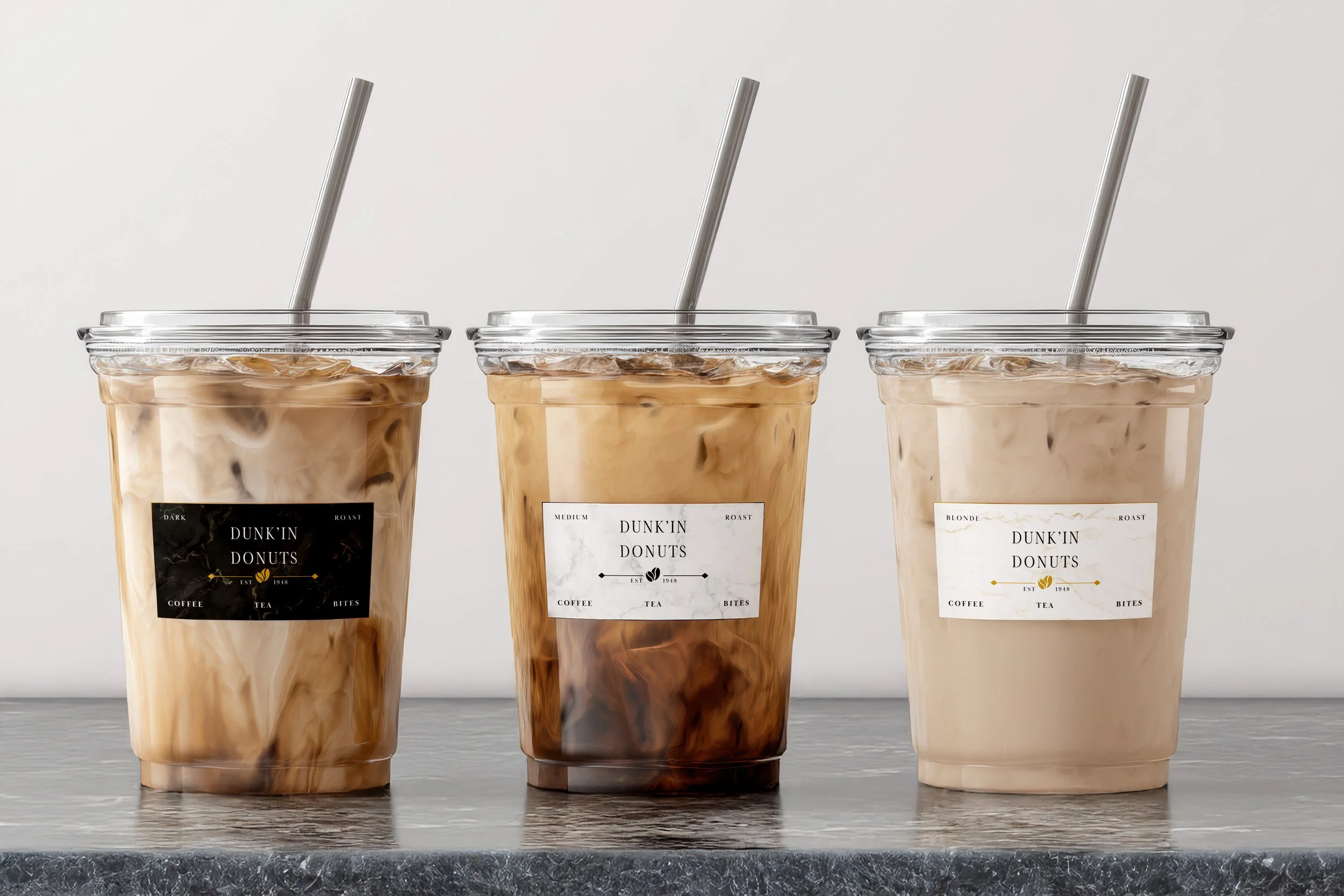
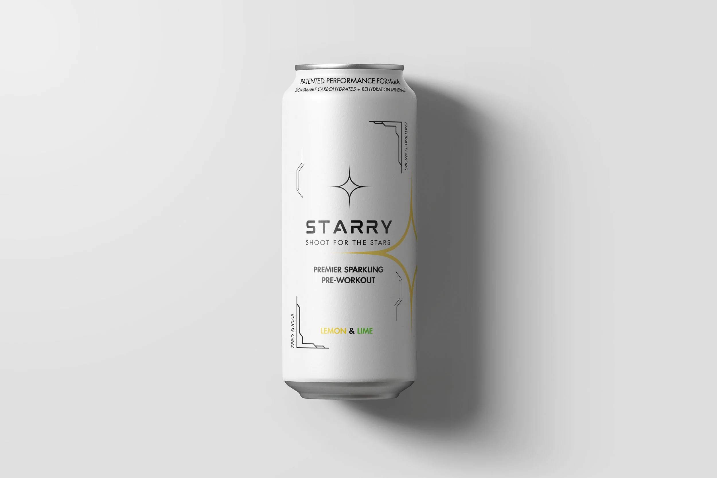
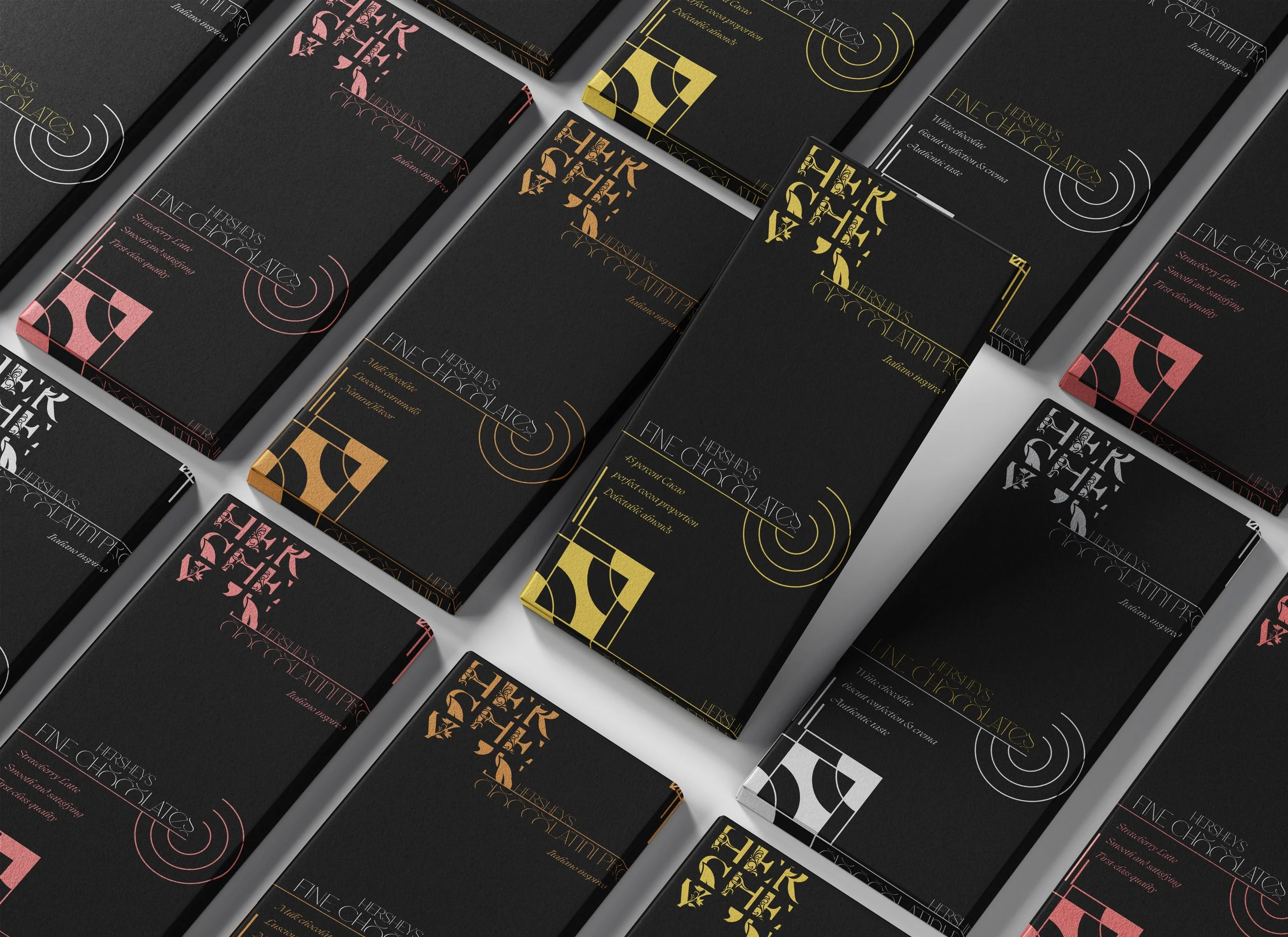
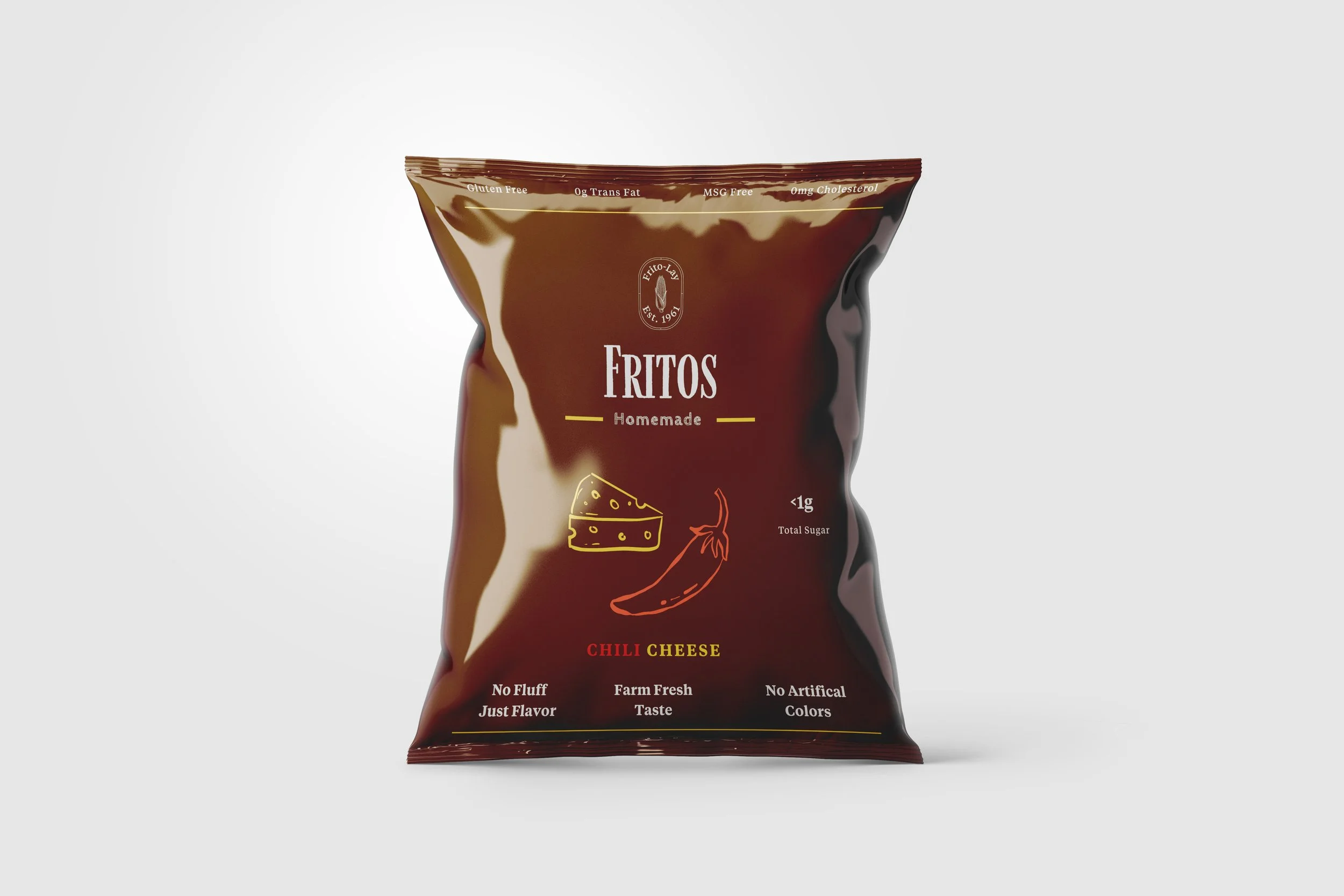
I began by deconstructing the original Mountain Dew brand and analyzing its ingredients. From there, I rewrote its nutrition claims using wellness-focused language to show how easy it is to “spin” junk food with the right buzzwords. Sugar became “Bioavailable Carbohydrates,” and sodium turned into “Rehydration Minerals.” I then redesigned the packaging with muted color palettes, clean typography, and organic motifs, leaning into the style of natural food products. Building on that idea, I expanded the series to other everyday products, exploring how far a rebrand could stretch perception. Hershey’s became a luxury chocolate brand with refined typography and gold accents, Dunkin’ Donuts was transformed into a minimalist café experience, Starry took on the identity of a post-gym recovery drink, and Fritos were reframed as a wholesome, homemade-style snack. Each rebrand challenged me to experiment with visual identity, tone, and marketing strategy—showing how design can make something entirely ordinary feel elevated, functional, or even aspirational.